Each button has either a custom_id or URL attached.
The id has to be provided by the user and can be used to identify the button in the ButtonInteractionEvent.
Example Usage
public class HelloBot extends ListenerAdapter {
  public void onSlashCommandInteraction(SlashCommandInteractionEvent event) {
      if (event.getName().equals("hello")) {
          event.reply("Click the button to say hello")
              .addComponents(
                ActionRow.of(
                  Button.primary("hello", "Click Me"), // Button with only a label
                  Button.success("emoji", Emoji.fromMarkdown("<:minn:245267426227388416>")))) // Button with only an emoji
              .queue();
      } else if (event.getName().equals("info")) {
          event.reply("Click the buttons for more info")
              .addComponents(
                  ActionRow.of(
                    // link buttons don't send events, they just open a link in the browser when clicked
                    Button.link("https://github.com/discord-jda/JDA", "GitHub")
                      .withEmoji(Emoji.fromMarkdown("<:github:849286315580719104>")), // Link Button with label and emoji
                    Button.link("https://docs.jda.wiki/", "Javadocs"))) // Link Button with only a label
              .queue();
      }
  }

  public void onButtonInteraction(ButtonInteractionEvent event) {
      if (event.getComponentId().equals("hello")) {
          event.reply("Hello :)").queue();
      }
  }
}
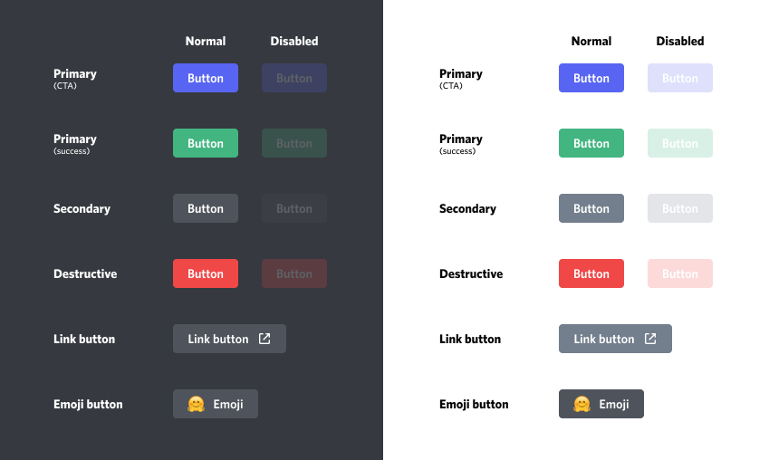
To see what each button looks like here is an example cheatsheet:
Creates a new component with the provided numeric ID.
If no ID is set, Discord will generate IDs incrementally starting from 1
and will not use existing IDs from the same message/modal.
Creates a button with PRIMARY Style.
The button is enabled and has no emoji attached by default.
You can use asDisabled() and withEmoji(Emoji) to further configure it.
Creates a button with SECONDARY Style.
The button is enabled and has no emoji attached by default.
You can use asDisabled() and withEmoji(Emoji) to further configure it.
Creates a button with SUCCESS Style.
The button is enabled and has no emoji attached by default.
You can use asDisabled() and withEmoji(Emoji) to further configure it.
Creates a button with DANGER Style.
The button is enabled and has no emoji attached by default.
You can use asDisabled() and withEmoji(Emoji) to further configure it.
Creates a button with LINK Style.
The button is enabled and has no emoji attached by default.
You can use asDisabled() and withEmoji(Emoji) to further configure it.
Note that link buttons never send a ButtonInteractionEvent.
These buttons only open a link for the user.
Creates a button with PREMIUM Style.
The button is enabled by default, and cannot have emojis attached to it.
You can use asDisabled() to further configure it.
Note that premium buttons never send a ButtonInteractionEvent.
These buttons only open a modal about the SKU.
Create a button with the provided style, URL or ID, and label.
The button is enabled and has no emoji attached by default.
You can use asDisabled() and withEmoji(Emoji) to further configure it.
Create a button with the provided style, URL or ID, and Emoji.
The button is enabled and has no text label.
To use labels you can use of(style, idOrUrl, label).withEmoji(emoji)
You provide a URL that is null, empty or longer than 512 characters, as defined by URL_MAX_LENGTH
or you provide an ID that is null, empty or longer than 100 characters, as defined by ID_MAX_LENGTH.
The label is non-null and longer than 80 characters, as defined by LABEL_MAX_LENGTH.
The label is null/empty, and the emoji is also null.
A label or emoji was provided for a PREMIUM-style button